Creating a homepage and improving the profile and activities page to help user interaction
Project Summary
Lykkå Village’s goals were for the Springboard UX designers to create a new homepage, a refined onboarding experience, a refined profile page, and a clearer activities page. They stressed that the team should use the current design to avoid having their developer spend time re-coding what they already had in place for their MVP. They wanted to ensure their developer could implement the designs so the MVP would be ready for consideration by potential investors.
The Springboard team’s goals were to minimize confusion around the onboarding and profile creation process, set clear expectations on utilizing the platform, and simplify the activities page within the four-week time-frame.
My Role
I was the team lead on the project, which included communicating with the client, scheduling meetings between teams, creating and finalizing the project plan, organizing the team’s work in Google Drive, and compiling the final presentation.
I was also a UX designer and executed journey mapping, user flows, competitor analysis, MoSCow chart, and wireframing of the homepage screens.
The Challenge
The initial problem we identified was the onboarding process's length. As their number one target user is a tired parent, we wanted to streamline that process and set clear expectations so the user knew what they were signing up for. We used this same mindset in the other platform areas that needed to be tightened up - the profile page and the activities page.
I also determined that there needed to be more communication on the platform to help users navigate it and encourage them to complete the questions on the onboarding and profile pages. I also found that there wasn’t a homepage at the beginning of the project, putting a recurring user into limbo, so creating a homepage became a top priority to create an initial touchpoint with the user.
The main users of the platform will be parents who are often tired, busy, and looking for low-lift solutions to finding local support systems for themselves and their households.
How might we easily connect individuals/households/families with other like-minded individuals/households/families in their immediate area to grow their local support system?
The Ideation Phase
The Springboard team proceeded with the double diamond design process because the client had already created a beta design, compiled discovery materials, and had a short project timeline.
The team used the provided user tests, personas, and the current live and test website to identify what other research was necessary to understand the company, its current platform, the business goals, and the potential design problems. While it was great to have some discovery material to work with from Lykkå, the Springboard team found it necessary to conduct the following research to better define and ideate.
-
Since Lykkå already had a beta design in place, it was important for the team to not only test the platform for functionality purposes, but also to understand the steps the user would take to achieve various goals on the platform, what was working well, what wasn’t working well, and what was missing.
-
Post journey mapping, it was time to take a top-down view to help us have a deeper understanding of the existing website and the dev. website. Creating the website architecture allowed the team to organize the content effectively and improve the user flows.
-
The heuristic analysis identified common usability issues using Nielsen’s Heuristics for Usability as a guide with the goal of improving the user’s experience and the platform’s success. This created a list of actionable recommendations to help immediately improve the usability and user experience of the platform.
-
After the baseline understanding was established, it was time to research like-minded competitors. The competitive analysis allowed the team to tap into the resources of the competition and identify how successful brands accomplished similar tasks and backed up design decisions.
-
After the analysis of other successful brands we had plenty of ideas but couldn’t implement them all. Due to the time limitations of the project, we had to rank our design strategy by priority and achievability via a MoSCoW chart — “must have,” “should have,” “could have,” and “won’t have” blocks.
This allowed the team to set realistic expectations on what is an actual “must have” and “should have” to capture in the platform designs.
Once the discovery and defining were completed, the team identified and developed solutions to deliver as designs for the Lykkå Village developer to implement.
As the team lead, it was my role to keep the team on track within our tight timeline and be very intentional in deciding how to execute the project.
The team used Figma, Zoom, and Google Suite (Docs, Slides, Sheets) during their work.
Homepage Wireframes
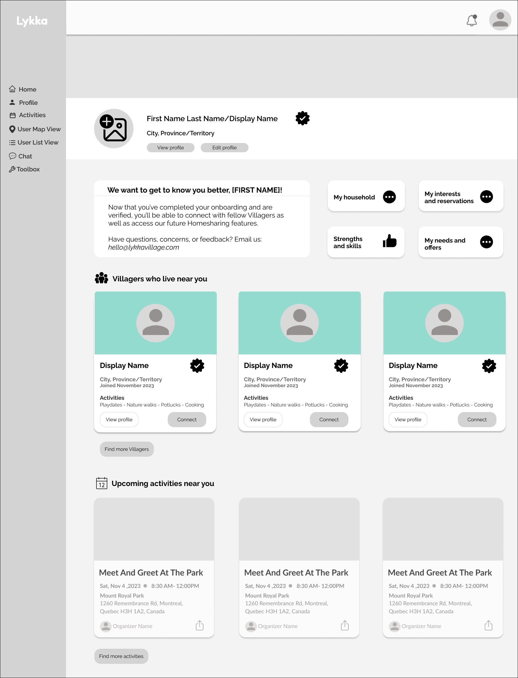
My focus was creating a homepage for the user to access immediately upon account creation & onboarding completion as well as every time they logged in.
Overall, the team was able to draft designs that could be implemented immediately toward the MVP, as well as future aspirational designs when additional capabilities, such as home-sharing, are added to the platform.
Screen #3 (above): Encourages users to complete more of their profile information so other Villagers can see what areas they match. There is now also a preview of nearby Villagers in addition to Activities.
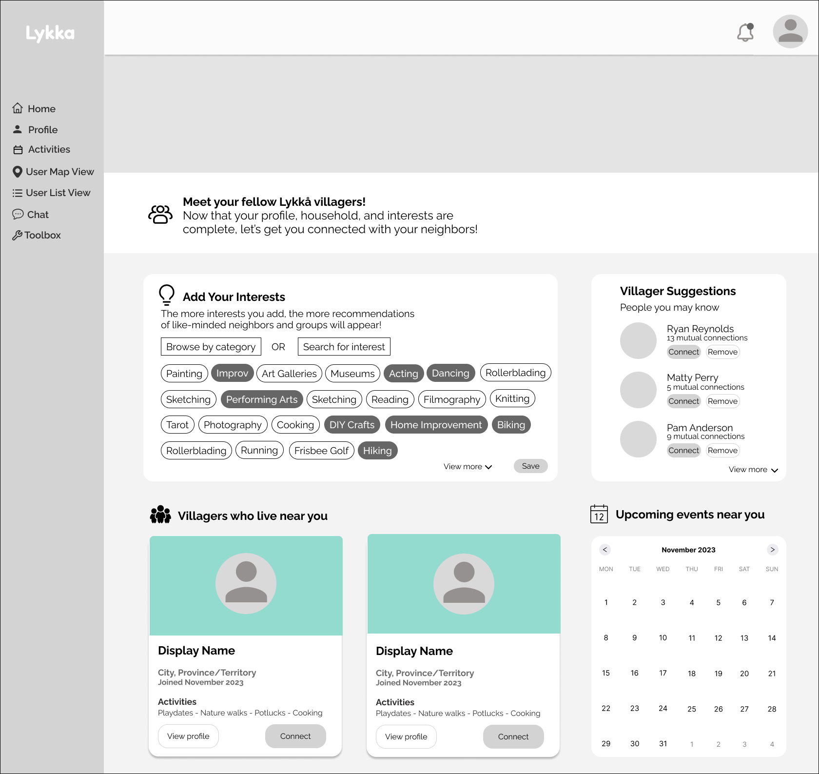
Screen #5 (above): Future design that creates an independent landing page that the user could access from the homepage to choose more interests and see Villager suggestions based on location, shared interests, similarities in profile answers, and upcoming activities.
The main goals of the homepage design were:
To set clear expectations for the user of what was still required to access the full functionality of the platform’s features.
To showcase nearby Villagers and activities to encourage the user to make local connections.
To create a one-click functionality to allow the user to effortlessly access the platform's onboarding, profile, and activities capabilities.
Screen #1 (above): Encourages the user to complete initial onboarding and ID verification so the user can access more of the platform.
Screen #4 (above): Encourages the user to choose interests and/or categories to match with other Villagers in the area.
Screen #6 (above): Future design that shows the interests and groups the user has chosen on previous screen. The design also features upcoming events that the user has saved, an activity calendar, and suggested Villagers that the user may want to connect with.
Screen #2 (above): Encourages the user to complete ID verification process and provides examples of the documentation needed to achieve this goal. By completing this process, the user can view nearby Villagers.
My Takeaways
I loved working with a small team of fellow designers, the company stakeholders, and the company’s developer. It was a welcome environment to bounce ideas off of one another as well as identify limitations and strengths.
If I had more time with the client, I would want to go through their platform materials in more depth, as they’ve worked with many different cohorts and don’t have a designated project manager keeping an organized system in place for all the materials that have populated for this platform.
Next Steps
Now that the Lykkå Village team has access to the Springboard team’s research, designs, and documentation, they will implement the recommendations into their MVP and do more rounds of user testing with their handpicked community members before presenting to potential investors.
Since the conclusion of the project, the Lykkå Village developer has already begun to implement the design recommendations. On the left is an example of a module message communicating to the user that their onboarding completion is still outstanding. This previously did not exist before our work with Lykkå.


