Simplifying content discovery by creating a reader profile and filters that help users quickly choose a story for their readers
Project Summary
Tiny Tales allows authors and illustrators to directly upload their creative works to an online platform that parents use to find stories to read to their child(ren) and/or for their child(ren) to read.
Tiny Tale’s goals were to improve user retention and user acquisition by making it as simple as possible to find stories that interest their readers.
My goal was to utilize the existing research and determine the MVP needed to accomplish Tiny Tale’s goals.
My Role
I was the sole UX designer on the sprint who used the following methodologies: brainstorming, storyboarding, sprint, wireframing, prototyping, and usability testing.
The tools I used during this sprint included Figma, Zoom, and Google Suite (Docs, Slides, Sheets).
The Challenge
How might we connect parents and their child(ren), quickly and easily, to the stories they want to read?
“I usually let my kids pick a topic that they like. Then I try to scan the book to see how long it is. Sometimes we just want a quick book before bed... if it’s long, I usually hav eto stop reading before it’s over.”
The primary users are parents of elementary school-aged children looking for stories to read to their children or for their child to practice their reading.
Since the user is not purchasing physical books to read, the preferred device to use the platform is a tablet, as it’s similar in size to a book. That is a requirement in the solution.
Being a content-heavy platform, the user needs to quickly access what they are looking for, as it can become overwhelming to sift through options, especially at the end of the day.
Unfortunately, parents expressed frustration at being unable to find the content they wanted easily, causing them not to want to use the platform.
My challenge was creating a user experience to help parents find the stories that fit their child(ren)’s interests.
Previous research and user interviews were provided, allowing me to map, sketch, design, prototype, and test within a one-week modified GV design sprint.
Day 1: Understand & Map
To begin understanding the problem, I reviewed Tiny Tales' research and persona materials, showing how parents chose stories for their children. This helped me identify a problem statement and an end-to-end user experience.
How might we connect parents and their child(ren) with the stories they want to read?
The end-to-end user experience:
Key takeaways from research and persona materials:
The importance of age-appropriate stories to keep the reader’s interest and meet their reading level.
Access to relevant reading topics/categories.
Knowing the length or time commitment of a story ahead of time.
The importance of seeing story recommendations from users with like-minded, similar-aged, and similar-reading levels.
The desire for reading time to be family time, an alternative to devices, and helpful to the reader’s development.
“My kids like to browse for a story to read with me... once I find one they like, I read the first few pages to make sure it’s the right age level for them.”
Day 2: Sketch
Before sketching out possible solutions, I wanted to understand better how the search functionality of other book-centric online platforms worked. I did a lightning demo to ignite some inspiration. I looked at Barnes & Noble, Amazon Kindle Books, Ello, Etsy, and the Solano County Public Library website.
Next, I completed the Crazy 8s method to develop eight ideas related to the challenge. Afterward, I decided that the most critical screen to design for would be the user identifying a reader’s preferences.
Day 3: Decide & Storyboard
I decided the user identifying a reader’s preferences was the most crucial screen because by providing this information to the platform, the technology can make personalized story recommendations for each reader, cutting down on the time a user spends searching for relevant stories. Also, the more information the platform has about the reader, the smarter it can be in suggesting stories.
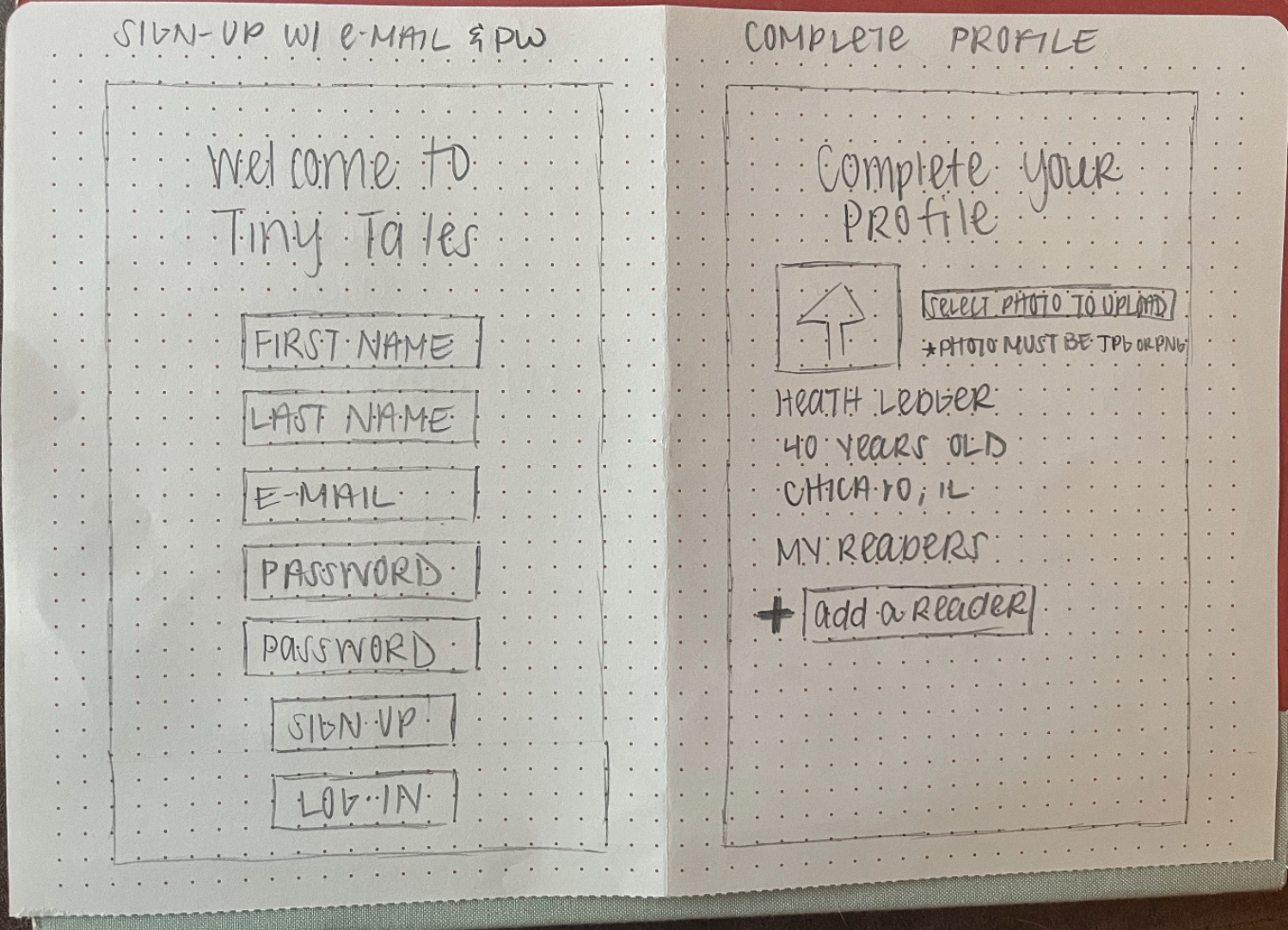
IMAGE LEFT: Sketches of before critical screen and critical screen - adding reader’s preferences.
IMAGE RIGHT: Sketch of after critical screen
Before moving onto developing screens on Figma, I sketched a storyboard to lay some groundwork.
Day 4: Prototype
Using the rough storyboard as my reference point, I drafted my wireframes and prototype using Figma.
Day 5: User Testing
I conducted moderated usability tests over Zoom with five people who would use a platform like Tiny Tales with their child(ren) or grandchild(ren) and collected their pros and cons while using an iPad prototype.
The sessions lasted between 20-30 minutes.
ABOVE: Story recommendation design prior to user testing
After the interviews, I incorporated feedback into drafting new screens for how readers’ recommended stories are presented to the user. Prior to the testing, the design had multiple recommendations featured at a smaller visual scale, but the majority of testers requested a larger visual scale that focused on one story at a time.
ABOVE: Story recommendation design after user testing feedback
My Takeaways
This was the quickest sprint that I have ever worked on my own or with a team. I enjoyed setting the sprint's pace but missed the collaboration of working with other team members.
It was outside my comfort zone, but I would like to do more of these in the future to build my confidence in my decision-making and design choices.
Next Steps
I’m interested in continuing to develop the designs to practice my Figma skills and better understand the parental user type via continued dialogue & user interviews/research.


